
“Art is what an artist says it is.” Marcel Duchamp
This statement, found in Drucker (and in lots of places online) intrigued me, especially as Duchamp’s urinal is so often referred to on the ART317 forum, so I decided to investigate him just enough that I got an overall gist of his philosophies. The sites I used are http://www.toutfait.com and http://www.marcelduchamp.net. In the 30 minutes I allowed myself to search these two sites I found:
He was interested in concepts of chance and metaphor, projection and eroticism as metaphor.
“Ideas such as the infra-thin, ambivalence, ambiguity, and ephemerality”
Rejected “the high seriousness prevalent in artistic circles in his own time”
“Duchamp’s views on avoiding repetition and on the irrelevance of style or the visual”
..... I'm thinking that 30 minuted is no where near sufficient for getting any sort of gist about this man's philosophies, (perhaps this site would be more succinct - for another day and more time) but I like his Art definition.
Sunday, June 7, 2009

Thursday, June 4, 2009
Artist's Book
These images are from a book that I created for a fictional Issey Miyake fashion show; a high end production where guests were sent an invitation and given a catalogue and a gift, all of which were part of the brief. The sky was the limits as far as budget was concerned. The materials used include a purchased book from which I used the cover and some pages; silk; Utee; micro beads; coloured mica powder; laser-printed images; ink; rubber stamps; fancy papers (including mulberry, vellum and form-molded); machine stitching; and transfer papers. The book is 12"x12".

 I scrapbook and make greeting cards so this book was somewhat a familiar territory for me in that I used or elaborated on many techniques that I was already familiar with. The degree of difficulty and finesse were above what I would go to for most of my scrapbooking endeavours and I spent considerable time tracking down materials.
 Normally when I create a scrapbook page or album I am doing so for the benefit of myself and my husband and children, or as a gift for a family member, such as grandparents. Most scrapbooking is ‘designed’ a page (or small group of pages) at a time – papers, embellishments and design elements are unique (in combination) to that page or layout and are chosen for their relationship to the photos that will be used.
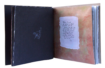


 The materials used include a purchased book from which I used the cover and some pages; silk; Utee; micro beads; coloured mica powder; laser-printed images; ink; rubber stamps; fancy papers (including mulberry, vellum and form-molded); machine stitching; and transfer papers. The book is 12"x12".

 I scrapbook and make greeting cards so this book was somewhat a familiar territory for me in that I used or elaborated on many techniques that I was already familiar with. The degree of difficulty and finesse were above what I would go to for most of my scrapbooking endeavours and I spent considerable time tracking down materials.
 Normally when I create a scrapbook page or album I am doing so for the benefit of myself and my husband and children, or as a gift for a family member, such as grandparents. Most scrapbooking is ‘designed’ a page (or small group of pages) at a time – papers, embellishments and design elements are unique (in combination) to that page or layout and are chosen for their relationship to the photos that will be used.

A slightly different approach was used here as I had a demographic to consider. Fortunately, as Miyake’s garments are so unique, and many of them could be considered more Art (there it is again!) than wearable clothes, I concluded that the audience invited to his show were of the same ilk – left-of-centre, visually oriented and creative. Miyake’s clothes beg to be touched and examined and so the catalogue has a highly textured cover piece, papers that range from embossed and rough to the feathery softness of torn mulberry, incorporates pleated silk and torn vellum, the pages are assembled with stitching that has its ends dangling, and the book is interspersed with hand-coloured pages.


Until the last few weeks I considered the catalogue to be 'craft' because of its similarity to my scrapbooking. Having read Drucker and explored quite a few books and internet sites relating to artist’s books, I think that I can change my description to Art, specifically Artist’s Book. My only difficulty now rests with self-definition. Am I a graphic designer, artist, crafter or a combination? I suppose that ultimately I am a combination of all three, with a lean towards a particular nomenclature with each creation.
Monday, May 18, 2009
The Shoemakers Present
Judging from this site, my little book is newer than a chap book, plus it's been printed in more than two colours: the maximum amount of colours the chap books here have been printed in. Also, the book has 64 pages, considerable more than most chap books.


Children's Illustrated Books Part II
- George Cruickshank's Comic Alphabet is a small accordion-folded book with 24 etchings representing the letters of the alphabet - I don't know what happened to the other two letters. It's interesting that the book doesn't use recognisable symbols for each letter as current alphabet books do. N for nightmare? O for Orpheus? It makes me glad I was educated in the 1970's not the 1870's.

- Why was chromolithography garish and unappealing? What are electrotype and photoengraving?
- I wanted to find some examples Edmund Evans' colour wood engraving. It seems the most famous children's illustrators to use this process are Walter Crane, Randolph Caldecott and Kate Greenaway.
Walter Crane

Randolph Caldecott

Kate Greenaway

The three styles of the above illustrators are very different from each other, and each of them are delightful in their own way - though I must say Crane's style is not really my cup of tea.
- The photographic process was used to transfer artist's drawings onto a block of wood. How was this transfer done?
- The illustrated children's book emerged as an important component of the publishing industry in the 20th century. What caused this - was it Edmund Evans?
- I wanted to find some samples of Jean de Brunhoff's Barbar and Edward Ardizonne's Little Tim. I'm not familiar with Little Tim but my boys have spent many a happy hour in from of the tv watching Barbar. I'd have gotten hold of some printed material for them, but I didn't know that Barbar had such wonderful beginnings, let alone have a presence outside the box.


Barbar


Interestingly, Jean de Brunhoff died at age 38 and only produced the first seven of these books; his son Laurent took over, producing Barbar books from 1948 till 2003.
- Jim Vadeboncoeur, Jr - what a wonderful man to produce such a site as this, featuring myriad children's illustrators covering so many genres that I can't list them all. From comic book characters to fearsome monsters with a few fables in-between this site will show you so much stuff about illustrators between 1880 and 1920; 105 of them to date - you won't remember where you started.
Developments Affecting Children's Illustrated Books Since 1800
This task, to create a timeline from 1800 to present day with major developments in printing and major children's book illustrators, is one I found difficult. There are so many wonderful illustrators to choose from, and a timeline can only fit so many entries before it becomes indecipherable.
But here it is...

There are many, many more illustrators of children's books. Here's a wonderful place to start looking if you're interested in finding out about some of them.
Note: Most illustrators had careers spanning many years, sometimes decades. The dates accompanying their names are either those provided by some of the research I've done, or have been picked from about the middle of the illustrators careers. This Google Book looks at some of the more contemporary illustrators. This site provides information and images about the very early children's books, chapbooks and some of the more famous illustrators of very early children's illustrated books such as George Cruikshank and Kate Greenaway.
But here it is...

There are many, many more illustrators of children's books. Here's a wonderful place to start looking if you're interested in finding out about some of them.
Note: Most illustrators had careers spanning many years, sometimes decades. The dates accompanying their names are either those provided by some of the research I've done, or have been picked from about the middle of the illustrators careers. This Google Book looks at some of the more contemporary illustrators. This site provides information and images about the very early children's books, chapbooks and some of the more famous illustrators of very early children's illustrated books such as George Cruikshank and Kate Greenaway.
Monday, May 4, 2009
Children's illustrated books Part I
Ok, a departure for me, I'm going to post before I have everything done. One of our readings has been Perry Nodelman's 'Picture Books' in The Pleasures of Children's Literature. I've read it through twice before and only tonight came to the conclusion that I don't agree with what he's written - and I'm only 4 pages into the reading...
He writes "Like words, in fact, pictures do not convey much meaning until we know the language in which they are expressed. Like words, they are "abstract", in the sense that they exist within systems of learned codes, and thus make little sense to anyone without a previous knowledge of those systems. Because pictures are premeated by the ideological assumptions of their culture, children will not understand pictures until they develop some understanding of the culture."
He writes "Like words, in fact, pictures do not convey much meaning until we know the language in which they are expressed. Like words, they are "abstract", in the sense that they exist within systems of learned codes, and thus make little sense to anyone without a previous knowledge of those systems. Because pictures are premeated by the ideological assumptions of their culture, children will not understand pictures until they develop some understanding of the culture."
I disagree that cultural understanding is necessary for children to understand pictures. Children are not taught cultural understanding - it is something that goes on around them, it's not 'culture', it just is. Until a child begins to learn of other places in the world that have a different culture from what they are raised in, 'culture' itself has no meaning for them. An apple pictured in an ABC book is available to a child who lives in a culture where apples are available, if not in their own home and eaten by them. An ABC book for African children, say, will have something else representing the letter A, and there's no reason to presume that that child won't know what the object representing 'A' is. Nodelman's point is relevant to adults, not children.
On another point - "Once we have experience in books and reading, visual information directs our response to the story in a picture book before we even open the book. Particular expectations arise from each of the physical qualities of a book: its size and its shape, even the kind of paper it is printed on."
How can this be? We have only to look at the plethora of children's book available at the local library to know that regardless of size or substrate we will be looking at a picture book that was considered good enough to make it into the library's collection. Does he mean that the higher the quality of paper, the better the illustrated book will be in terms of its value to children? Or that a bigger book will have more illustrations than a smaller one? Has children's illustrated books changed so much since 1992 when Nodelman wrote this?
One of the children's books I have is Green Air, written by Jill Morris and illustrated by Lindsay Muir (Queensland: Greater Glider Productions, 1997). My children and I have gotten far more enjoyment from this book than they ever have had, or ever will have, from The Classic Fairy Tale Treasury (various author and illustrators, Kansas: Andrews and McMeel/Areil Books, 1995). The first is a thin paperback in a square format on good quality paper. The second is a tallish, thick rectangular hardback book with a padded cover and gold page edges, also on good quality paper. I'm sure the expectation of the gift-giver of each book was that they would be enjoyed again and again by my children. Not so; even over the course of reading to my children for many years I got far more requests for Green Air than I ever did for The Classic Fairy Tale Treasury. What's that old saying - 'don't judge a book by its cover'?
I'm going to quote a passage from page 131 of The Pleasures of Children's Literature:
"In earlier times before Euro-American culture became so pervasive, many anthropologists and explorers showed tribal people in Africa or South America realistic drawings and even photographs. These people, unaquainted with Western culture, were often unable to recognise what the pictures depicted. Because such depictions did not exist in their cultures, they had no strategies for making sense of them.
The pictures that did exist had purposes different from our pictures, and showed the world in a different way. Jan Deregowski reports a study in which some African villagers preferred a split-type drawing of an elephant (showing it from above as if it had been split open, so that all four feet could be seen), while Europeans preferred a top view that did not show the feet. Deregowski says that the different responses come from a different understanding of what pictures are for: "Split-representation drawings develop in cultures where the products of art serve as labels or marks of identification. In the cultures where drawings are intended to convey what an object actually looks like, this style is muted and the 'perspective' style is adopted."
Having disagreed with what Mr Nodelman has said and on a lighter note, I find this staggering - not he fact that the split-drawing style is used by the African villagers, but because I can't 'picture' what such a picture would look like! Luckily the internet is really is all-knowing, here's an example of split-drawing.
Thursday, April 23, 2009
The Printed Book part 3
I enjoyed reading and got a lot from "The World of the Renaissance Print Shop"; more so than "The Book: Its Visual Appearance" (as supplied on the course CD-ROM), which I found to be a much heavier and dryer reading. Merry Wiesner-Hanks provides a light-hearted view into the world of incunabula and their readers. I have come across many references to serious biblical manuscripts and publications so far in this course, and it was delightful to find out that the people of the Renaissance weren't really so very different from people today, as illustrated by Weisner-Hanks when she compares chap-books from then with publications (high and low) of now. It was also delightful to read of the middle-class who got both religion and affordable entertainment from cheap secular publications. With such a plethora of printed material being available for the first time I can see how the term ‘Renaissance man’ came about; I’d love to be able to visit that book fair in Frankfurt!
A couple of questions arose from the reading. Regarding this quote: "Even though the printing press provided for the reproduction of texts more quickly and easily by hand, a large amount of time was still taken to illuminate and sometimes hand illustrate books of this period. Another popular method of illustrating texts was the use of the woodblock print. Printers at this time also began to work with engraved metal plates." When would hand illustrating be done versus woodblock illustrating?
And this one "both block prints for single sheets like playing cards and broadsides (small posters) and block prints which were bound together in small booklets." What small booklets were produced? The chap-books, or is this a reference to the Biblia Pauperum or other secular texts?
Wiesner-Hanks helped provide an answer to a question from my blog post The Printed Book part 1 concerning the composition of the ink Guttenberg printed with: "The ink was adapted from Flemish artists' ink".
PS I’d be interested to find out who the authors of the romantic books were – look out Dame Cartland!
This quote is from "The Book: its Visual Appearance" (Febvre, L. London: NLB) and refers to four main styles of script used in incunabula: traditional black letter gothic; the missal letter, a larger sized gothic; the 'bastard' gothic; and the 'littera antiqua'.
" This rapid summary of what was in reality a much more complex set of overlapping styles, defying rigid classification, must not mislead the reader. Intermediate styles of all kinds are extant between the four ideal types just enumerated; the gothic used by the scribes of Bologna, for example, was influenced by the humanist script; and there existed considerable regional varieties within each type of script. The Parisian bastarda type, which was born in the Royal Chancellery and was used in vernacular manuscripts, and which was to inspire the type of Verard and of Le Noir, differed from the bastarda used in the Low Countries to reproduce the texts of John Bruges, which was in turn the model for the type produced by the Bruges printer, Colard Mansion. In fact, regional characteristics were so marked a feature that the experienced eye can assign a manuscript to a particular locality with ease."
I think it's fascinating that type can be isolated to particular regions in the same way that dialects can. Keeping with the french example, Parisian French is aurally quite distinct from French spoken in the south of France, a dialect known as Occitan.
Febvre refers to Cicero's Epistolae ad Atticum, printed by Nicolas Jenson in Venice in 1475 using a roman typeface, as a "masterpiece", and I absolutely agree with him! Learning is often accomplished by studying the work of others and as a graphic designer the ways typography can be used is of prime importance to me. Unfortunately I can't read Latin, or I'd be able to assess the wisdom of the right and left justification in the sample from Cicero's book below; one of our reading did mention that in order to make optimal use of parchment/paper Latin can be abbreviated quite extensively by replacing words with symbols, but I love the ligatures!

A great web site that has a lot of good information about incunabula, with images is here. I especially liked being able to get a good look at the fonts referred to in this reading.
A minor curiosity with this reading - it refers to woodblock printing as xylography. I wonder why the name changed?
It's interesting that the reading refers to 'picture books' in relation to the bible (amongst others such as Hortulus Animae, obviously a book about animals). For Example, Drurer's wood engravings in the Apocalypse (1498), the Grand Passion (1498-1501), the Life of the Virgin (1502-1510) " which came out as prints, then in book from with letterpress accompaniment". And: "Meanwhile the Strasbourg printers, especially Gruninger, were turning out picture books. The Strasbourger, hans Weiditz the Younger, a pupil of Burgkmair, was perhaps the best painter-engraver of his day and he illustrated the German bible for Knobloch (1524), and perhaps the Gluksbuch of Petrarch published by Steyner at Ausburg in 1532."
When did 'picture book' come to mean a book, usually for children, with many illustrations, written in a simple style?
From the Reading "The Birth of Printing"; I didn't realise that: "Printing was the first major application of mass production and the use of interchangeable parts and one of the few applications of these techniques until the Industrial Revolution three centuries later."
A couple of questions arose from the reading. Regarding this quote: "Even though the printing press provided for the reproduction of texts more quickly and easily by hand, a large amount of time was still taken to illuminate and sometimes hand illustrate books of this period. Another popular method of illustrating texts was the use of the woodblock print. Printers at this time also began to work with engraved metal plates." When would hand illustrating be done versus woodblock illustrating?
And this one "both block prints for single sheets like playing cards and broadsides (small posters) and block prints which were bound together in small booklets." What small booklets were produced? The chap-books, or is this a reference to the Biblia Pauperum or other secular texts?
Wiesner-Hanks helped provide an answer to a question from my blog post The Printed Book part 1 concerning the composition of the ink Guttenberg printed with: "The ink was adapted from Flemish artists' ink".
PS I’d be interested to find out who the authors of the romantic books were – look out Dame Cartland!
This quote is from "The Book: its Visual Appearance" (Febvre, L. London: NLB) and refers to four main styles of script used in incunabula: traditional black letter gothic; the missal letter, a larger sized gothic; the 'bastard' gothic; and the 'littera antiqua'.
" This rapid summary of what was in reality a much more complex set of overlapping styles, defying rigid classification, must not mislead the reader. Intermediate styles of all kinds are extant between the four ideal types just enumerated; the gothic used by the scribes of Bologna, for example, was influenced by the humanist script; and there existed considerable regional varieties within each type of script. The Parisian bastarda type, which was born in the Royal Chancellery and was used in vernacular manuscripts, and which was to inspire the type of Verard and of Le Noir, differed from the bastarda used in the Low Countries to reproduce the texts of John Bruges, which was in turn the model for the type produced by the Bruges printer, Colard Mansion. In fact, regional characteristics were so marked a feature that the experienced eye can assign a manuscript to a particular locality with ease."
I think it's fascinating that type can be isolated to particular regions in the same way that dialects can. Keeping with the french example, Parisian French is aurally quite distinct from French spoken in the south of France, a dialect known as Occitan.
Febvre refers to Cicero's Epistolae ad Atticum, printed by Nicolas Jenson in Venice in 1475 using a roman typeface, as a "masterpiece", and I absolutely agree with him! Learning is often accomplished by studying the work of others and as a graphic designer the ways typography can be used is of prime importance to me. Unfortunately I can't read Latin, or I'd be able to assess the wisdom of the right and left justification in the sample from Cicero's book below; one of our reading did mention that in order to make optimal use of parchment/paper Latin can be abbreviated quite extensively by replacing words with symbols, but I love the ligatures!

A great web site that has a lot of good information about incunabula, with images is here. I especially liked being able to get a good look at the fonts referred to in this reading.
A minor curiosity with this reading - it refers to woodblock printing as xylography. I wonder why the name changed?
It's interesting that the reading refers to 'picture books' in relation to the bible (amongst others such as Hortulus Animae, obviously a book about animals). For Example, Drurer's wood engravings in the Apocalypse (1498), the Grand Passion (1498-1501), the Life of the Virgin (1502-1510) " which came out as prints, then in book from with letterpress accompaniment". And: "Meanwhile the Strasbourg printers, especially Gruninger, were turning out picture books. The Strasbourger, hans Weiditz the Younger, a pupil of Burgkmair, was perhaps the best painter-engraver of his day and he illustrated the German bible for Knobloch (1524), and perhaps the Gluksbuch of Petrarch published by Steyner at Ausburg in 1532."
When did 'picture book' come to mean a book, usually for children, with many illustrations, written in a simple style?
From the Reading "The Birth of Printing"; I didn't realise that: "Printing was the first major application of mass production and the use of interchangeable parts and one of the few applications of these techniques until the Industrial Revolution three centuries later."
Subscribe to:
Posts (Atom)